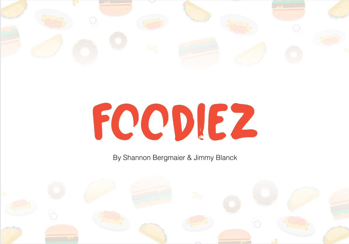
Overview
During my Interaction Design class, we were challenged to think about how users would best interact with our products and how we could meet their needs. For this project, I was in a team of two with the goal to create an application that could be used on a tablet. My partner and I had to determine who our user was and what problem we were going to solve in an application. This was the start of the production of our app, "Foodiez."
Team: Shannon Bergmaier & Jimmy Blanck
Tools Used:
Procreate - Figma - Illustrator - Photoshop - AfterEffects
Final Presentation
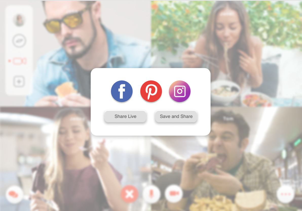
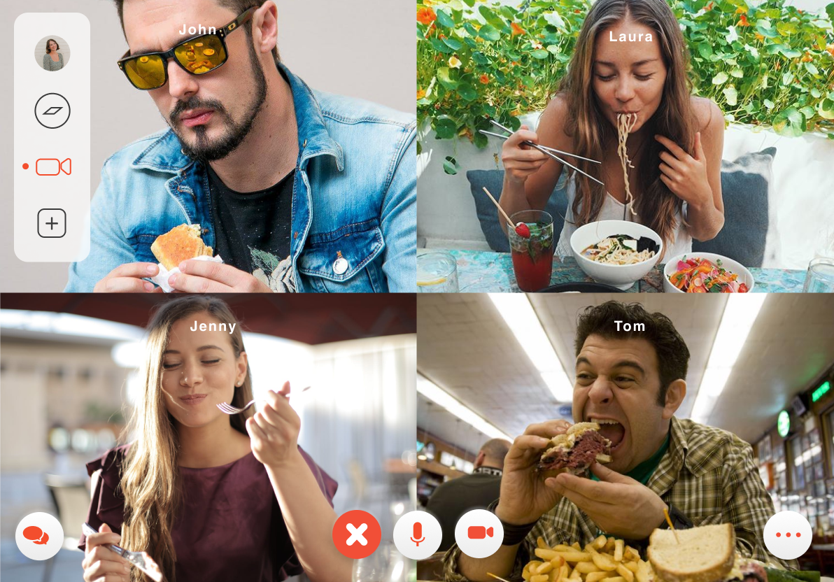
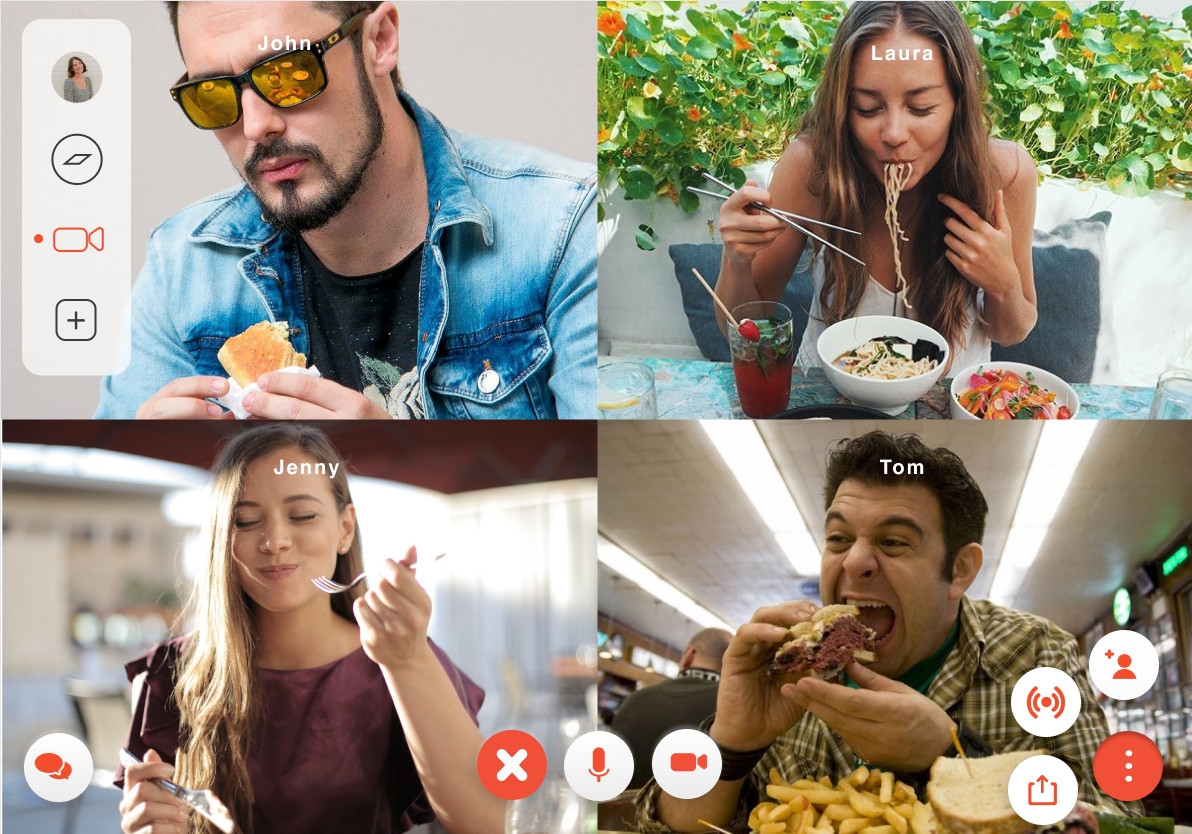
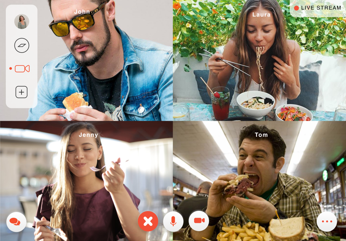
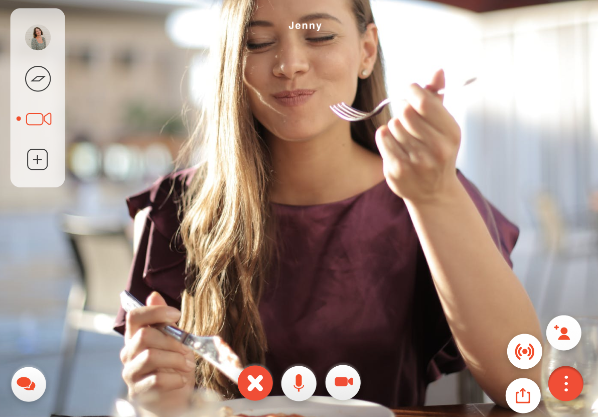
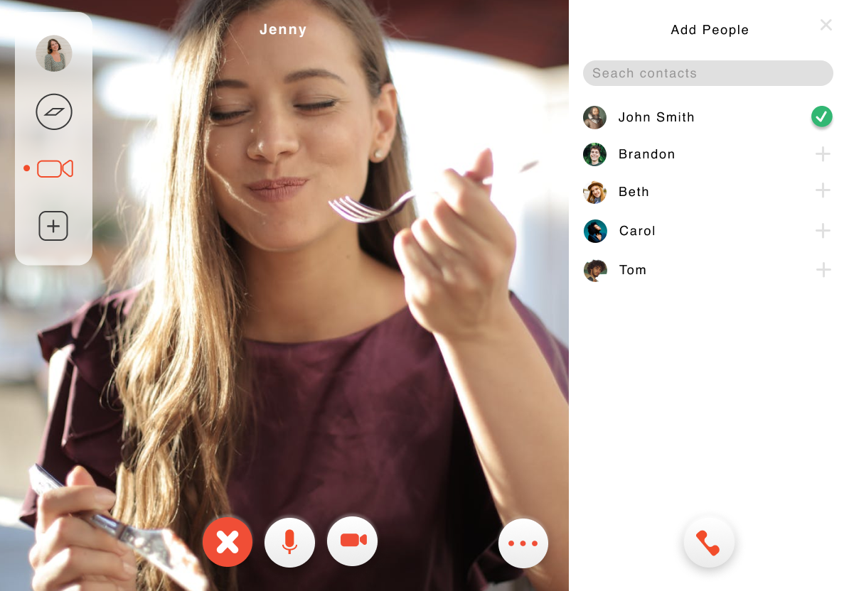
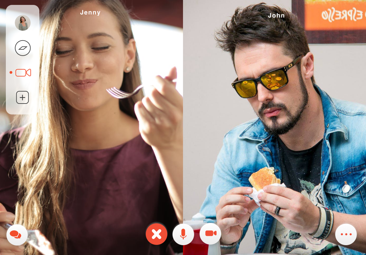
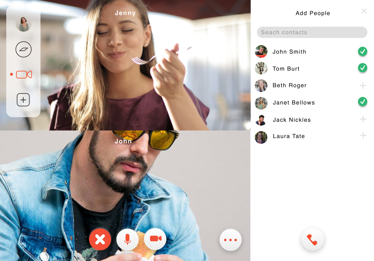
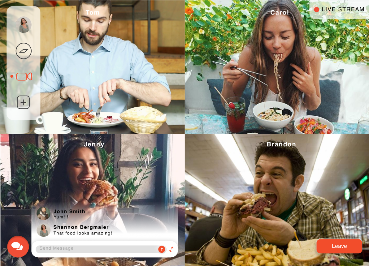
To the right is the final presentation. I worked on the motion for the login page and the explore page. Jimmy worked on the motion for the video-related pages. When we had all our portions saved and exported, I took them and combined them in the AfterEffects for the final presentation. I added the text screens and arranged the videos to flow throughout. I also added the song in the background.
Initial Process
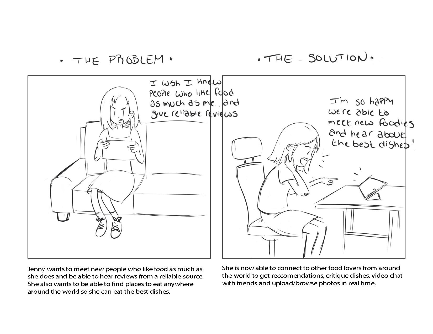
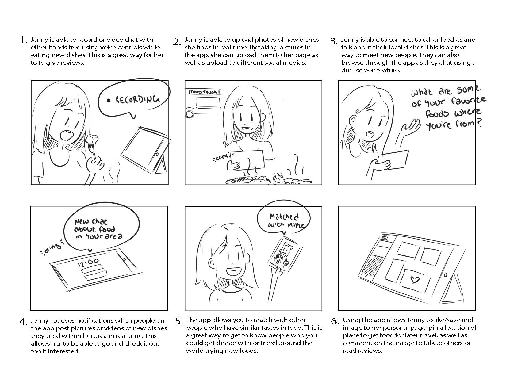
After discussing the problem we wanted to solve (connecting food lovers together from around the world to share conversation and favorite food dishes), we created our "Determine the User" diagram. My partner drew out the images used to tell the story and I put them together and added text explaining our goals.
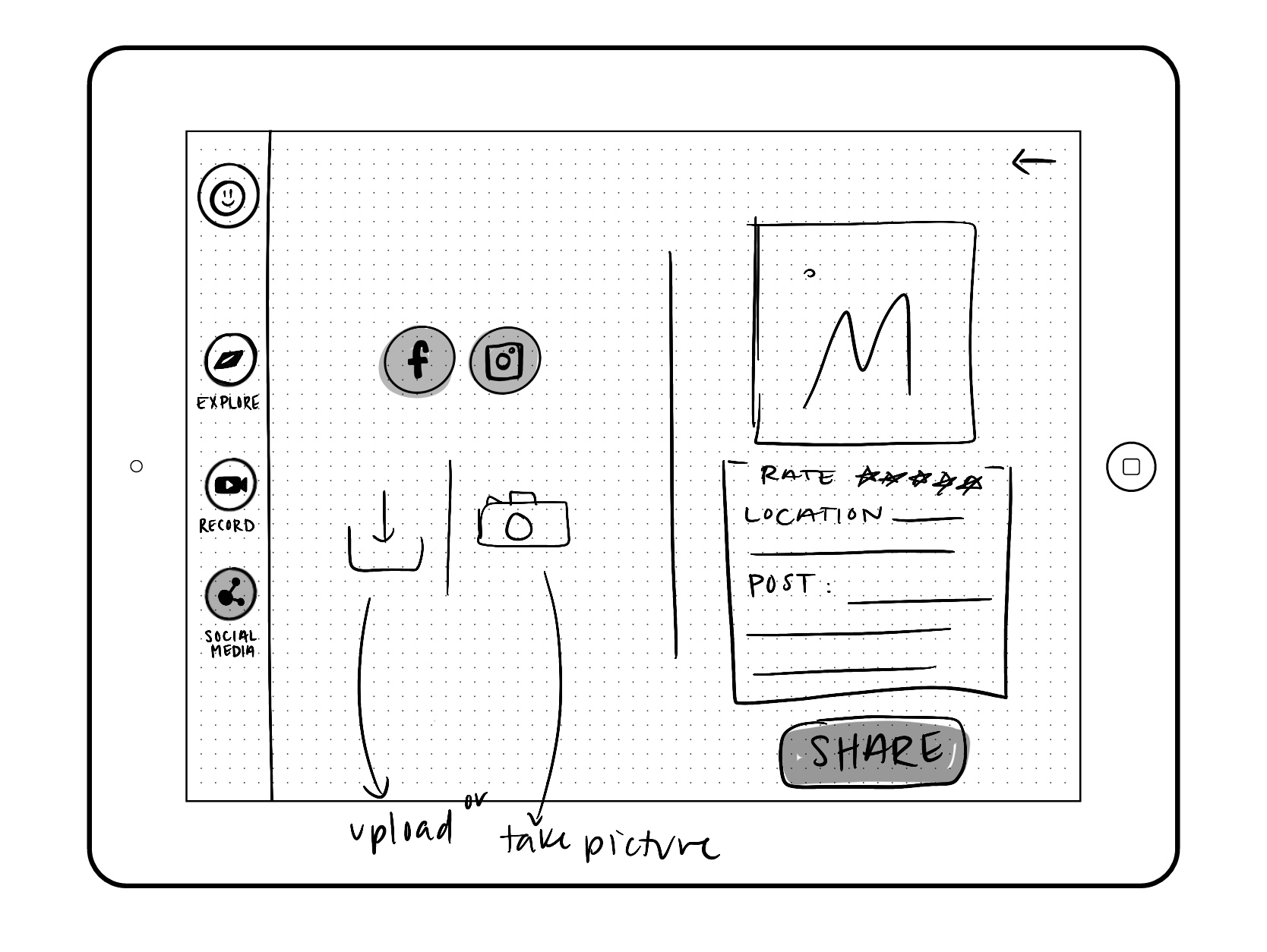
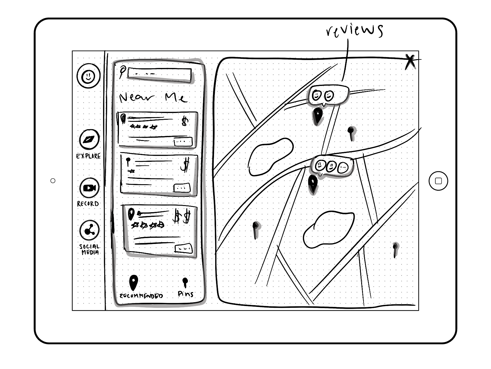
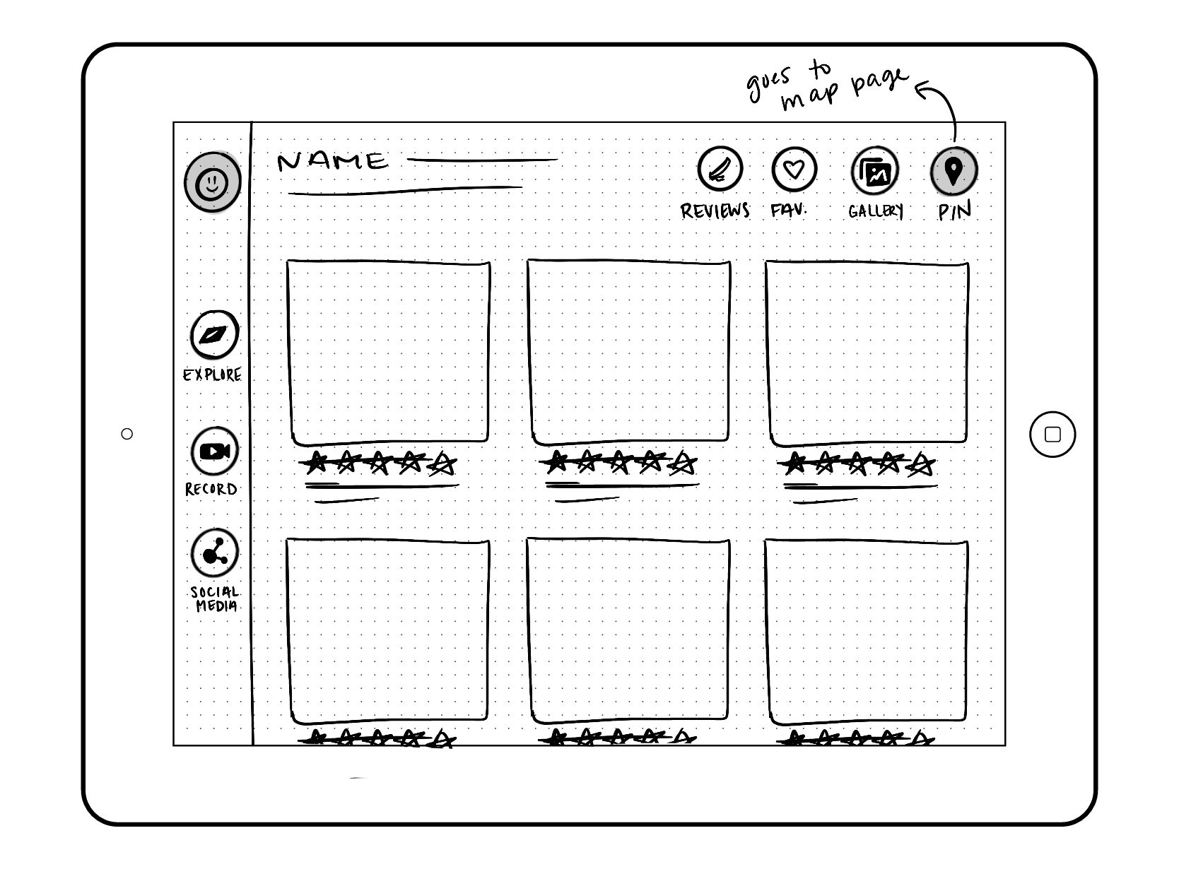
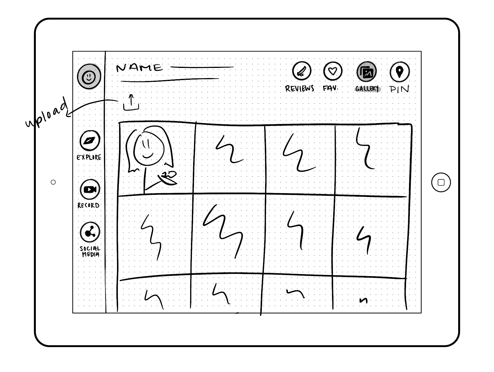
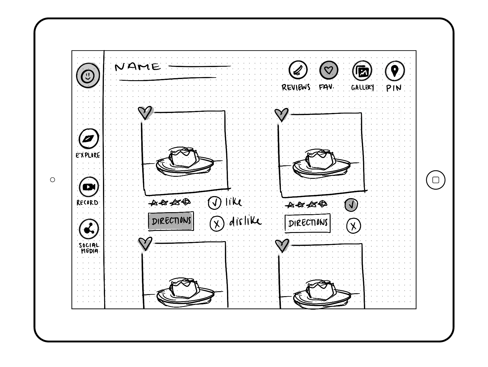
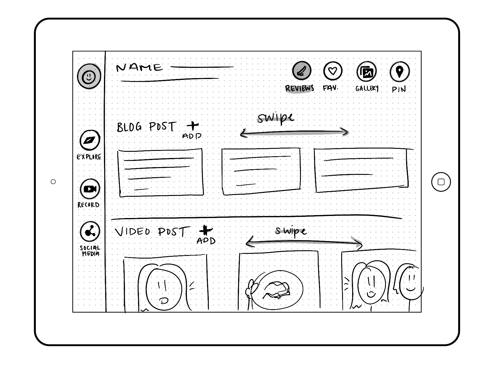
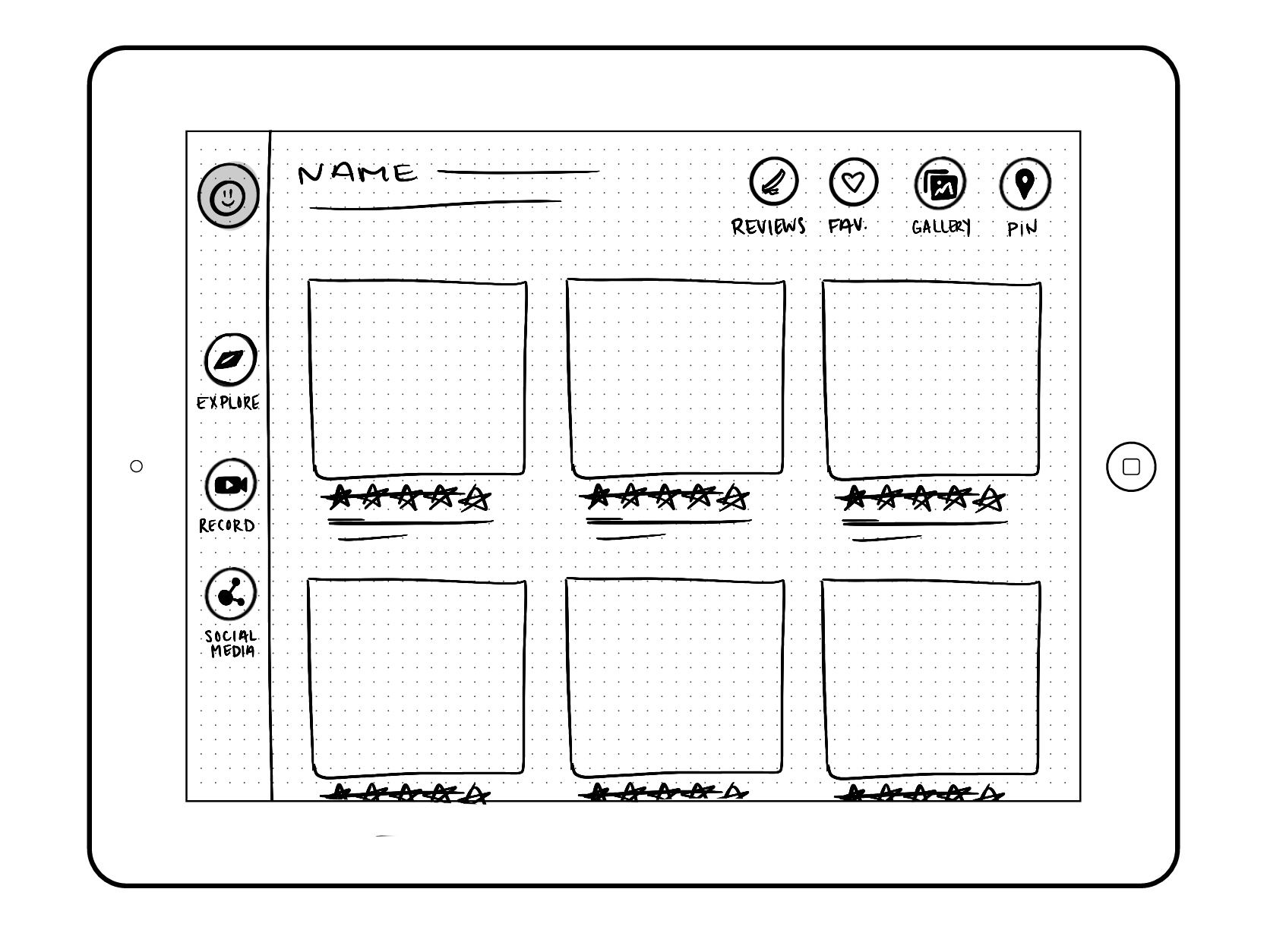
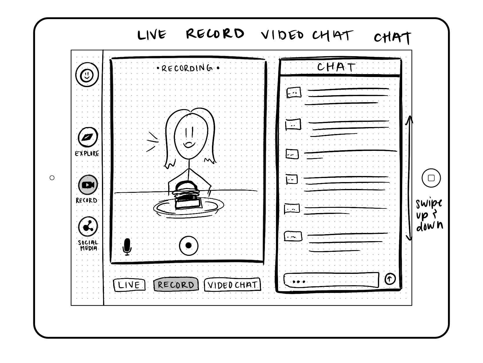
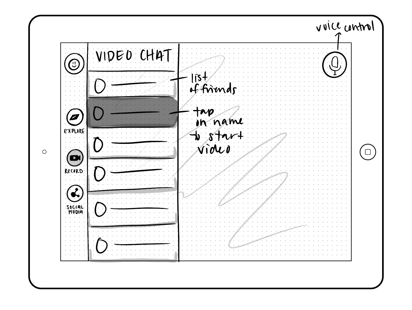
Wireframe
After developing our idea, we moved on to sketching out what our application would look like. This helped us gain a better understanding of how our ideas would work together. Below are the sketches that I created myself. My partner also did his own version so we could share in class to get more effective feedback on whose style worked best.


Draft Video
As we were able to come to a more consistent style and had a good idea what our application would look like, we worked in Figma to make a more defined prototype. The video to the left is a quick walk through using Figma after we created our elements. I recorded the walk through and my partner provided his sketches as a placeholder of the screens.
Style Guide
Now we add some color. After we went through the process of creating wireframes and making our prototype, we started on the fun part of design. My partner and I each researched colors and style elements that would best fit with our overall design. We wanted our app to be fun, engaging, bubbly, and overall, a welcoming space. We also wanted our colors to correlate to food so our focus was on yellow and red tones.
According to psychology, when people see yellow and red together, they become hungry. This was an important find since our application is related directly to food and people sharing what their favorite foods are and where to find them.

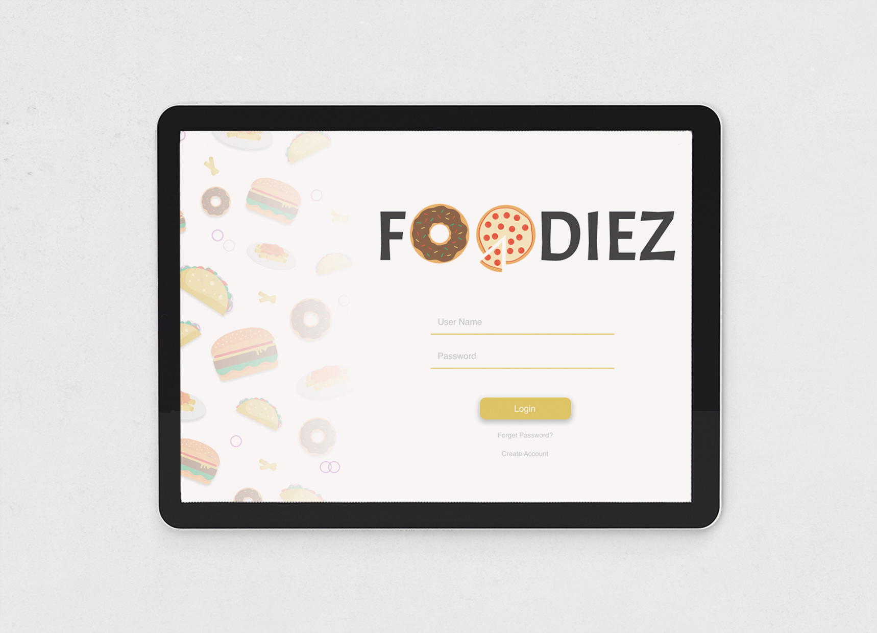
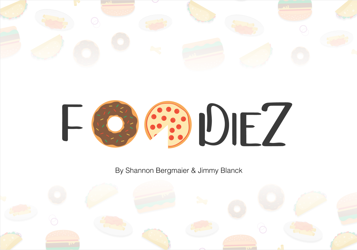
Title Screens
As we developed our final screens, we brainstormed a few fun title pages. Here are three versions I created, but you will see the final title screen used in the final presentation at the top.

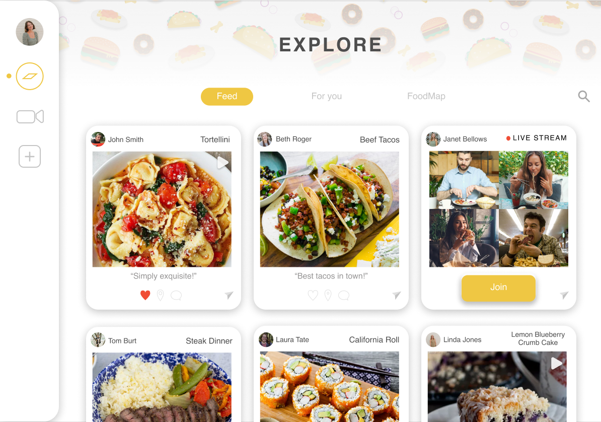
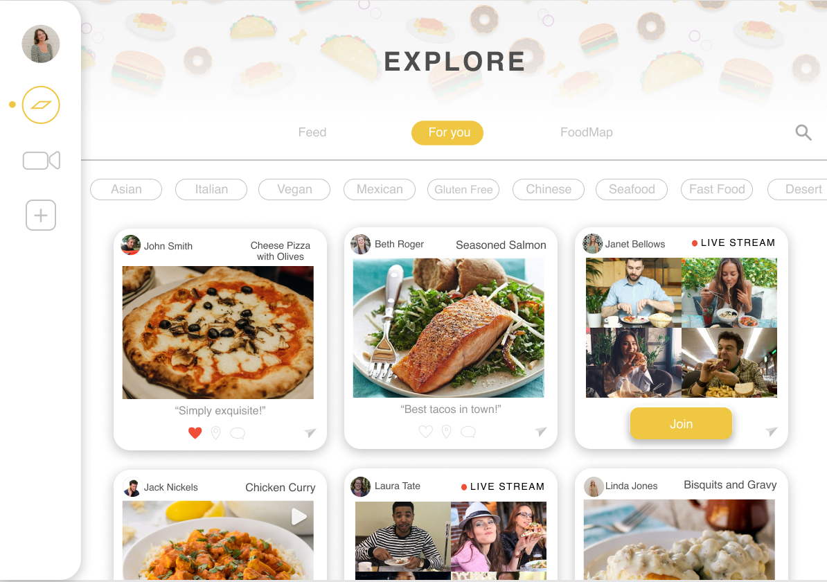
Final Wireframe Screens
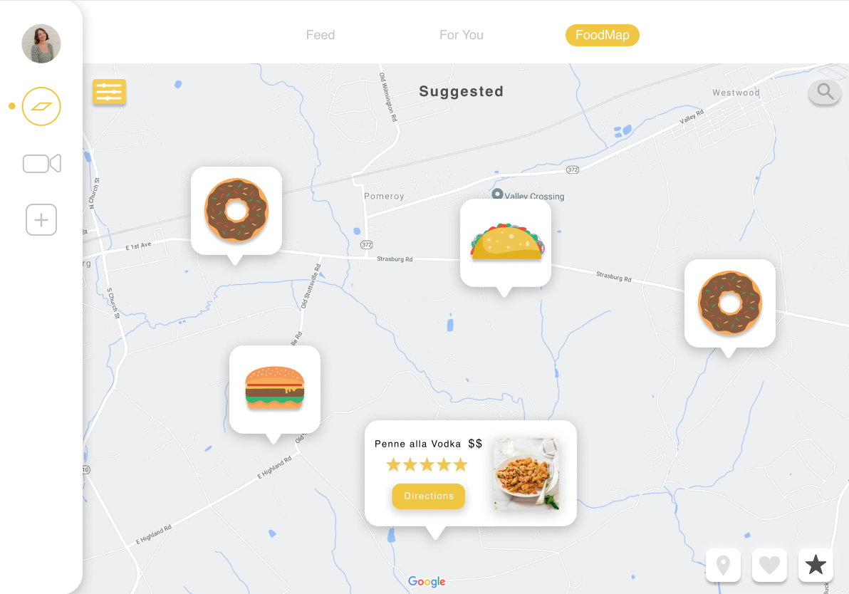
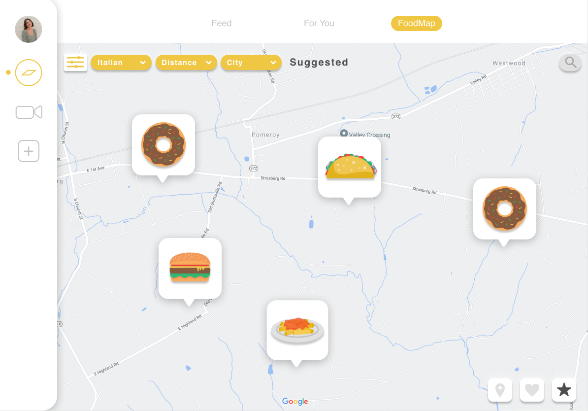
Continuing on... below are some of our final screens we created to get a better feel for what our application would look like. I worked on the login page, explore page and the map feature. My partner focused on the video screens that are remaining, but I also made sure all the screens were consistent all throughout.


Prototype Videos
Below are two prototypes of the login screen and also the explore page.