Restorative Physical Therapy & Restoration (RPTR) is was a start up physical therapy company some friends of mine started. They reached out to my in the Fall of 2022 and asked me to create their branding and logo for them. I was thrilled to get the opportunity to design a logo for them and to challenge myself.
Tools Used:
- Procreate - Illustrator
Design Process
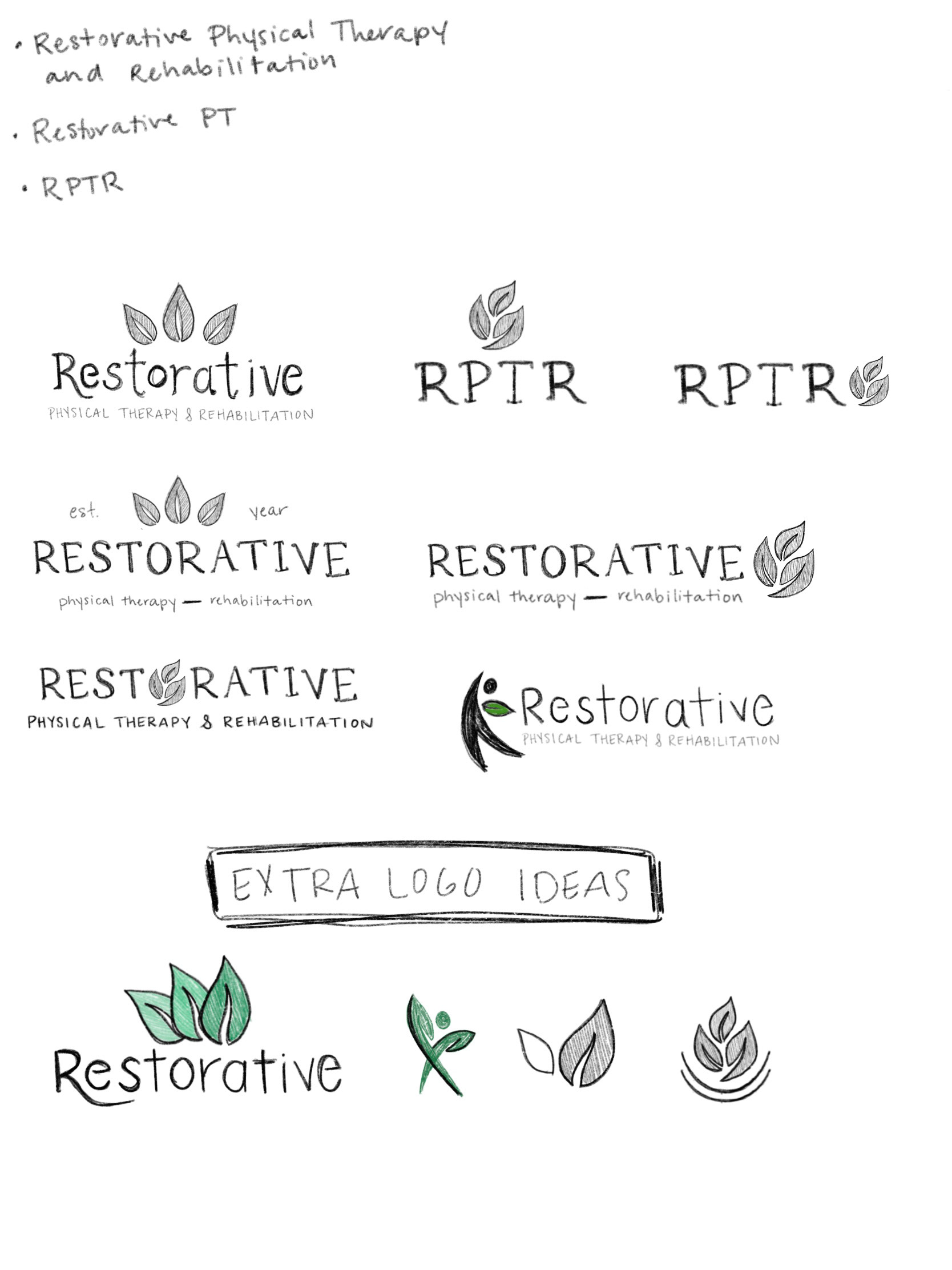
I began my creative process by researching different physical therapy related companies and icons associated with that business. Next, I went to my iPad and started to sketch out ideas.
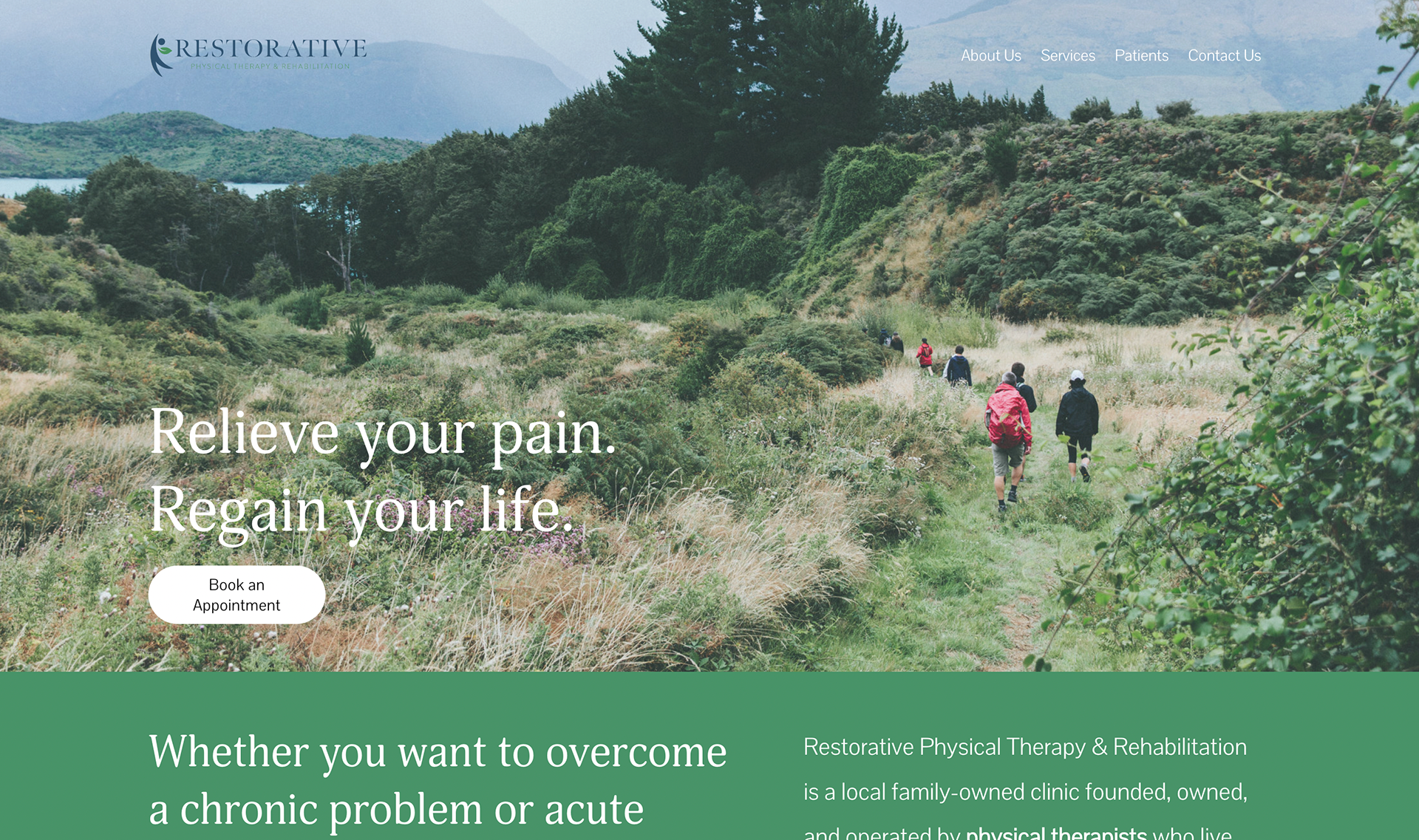
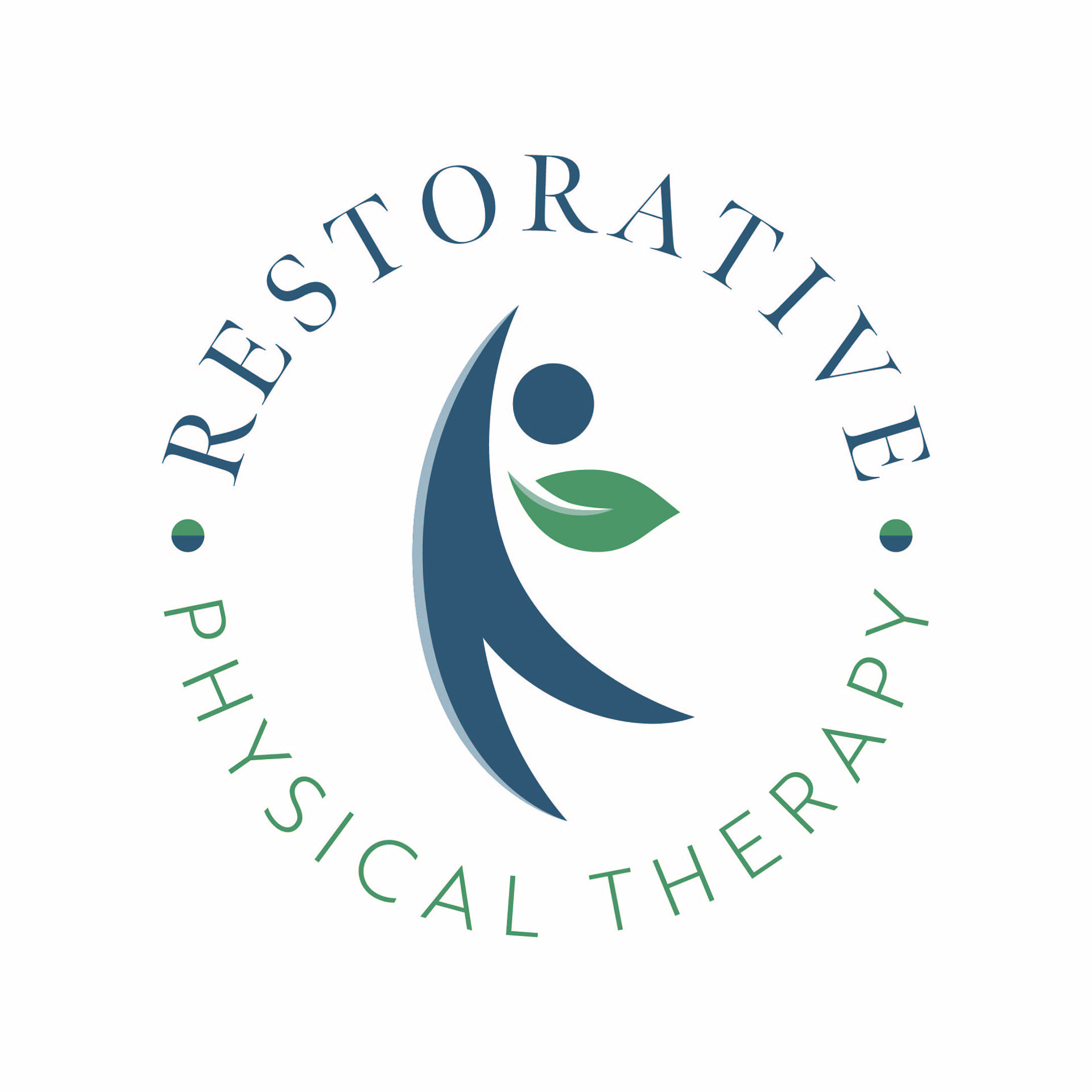
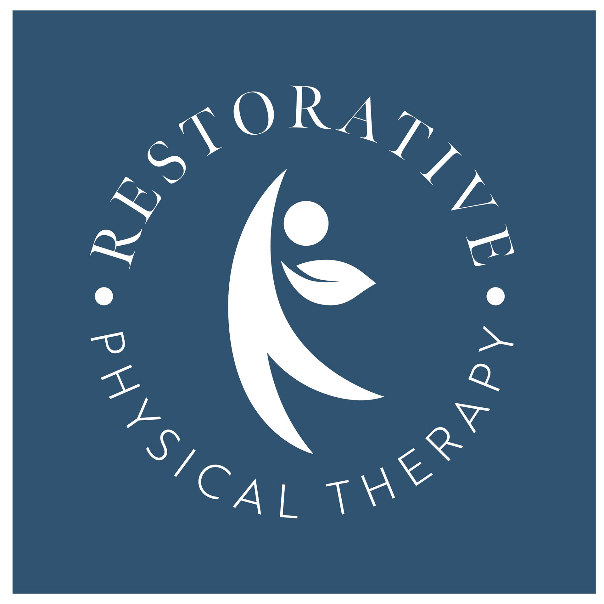
I knew I wanted to utilize the color green since green often symbolizes life, restoration, and renual. I felt that fit perfect for this company and their mission. I adopted the blue color into this palette since it complements the green well and also brings a feeling of calmness and peace. These colors are also very common color schemes within this field.
Along the same lines of life and restoration, leaves were a symbol I felt aligned well. I worked on multiple sketches using leaves in different ways and sent them to RPTR for review.
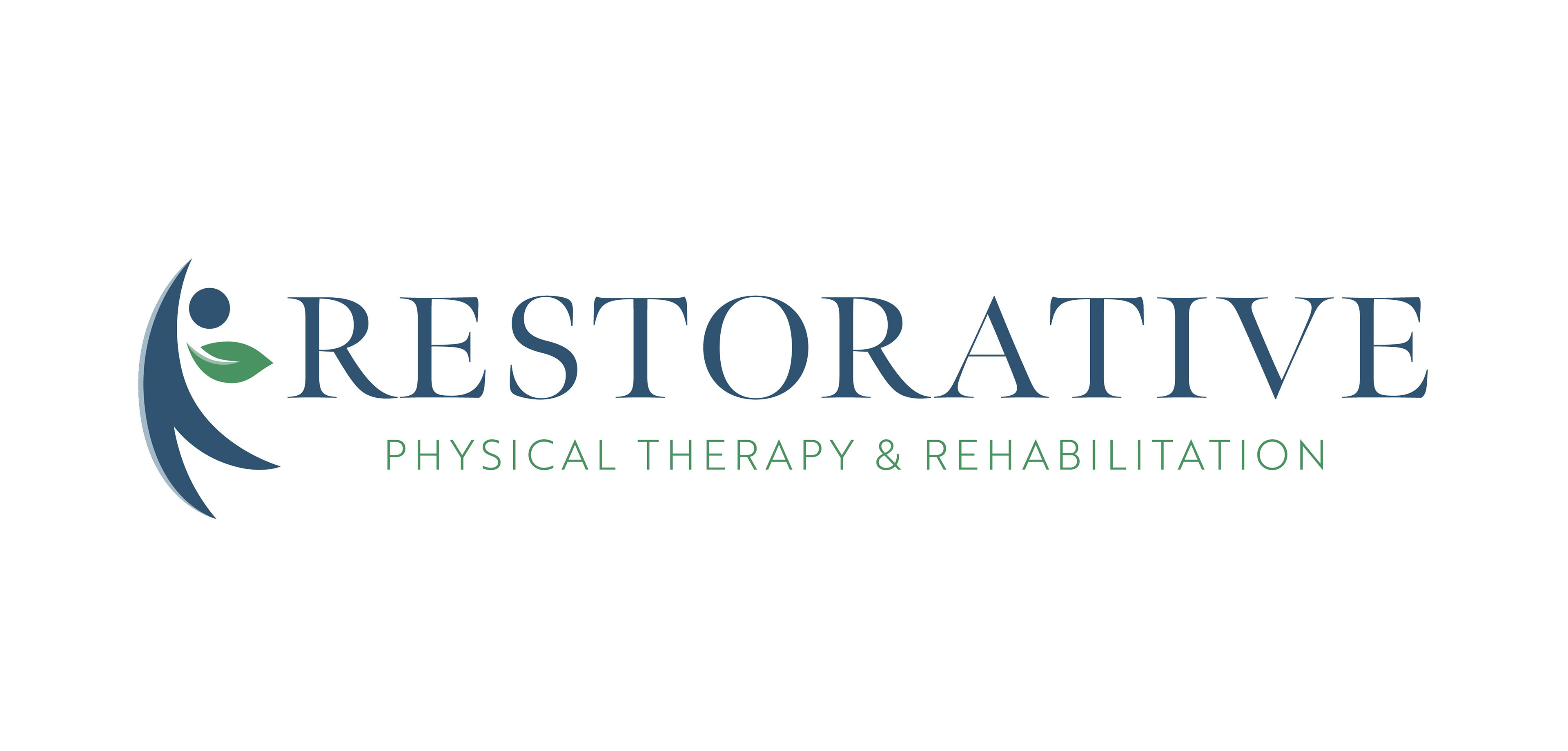
They loved the idea of having the shape of a person incorporating the leaf as the arm.
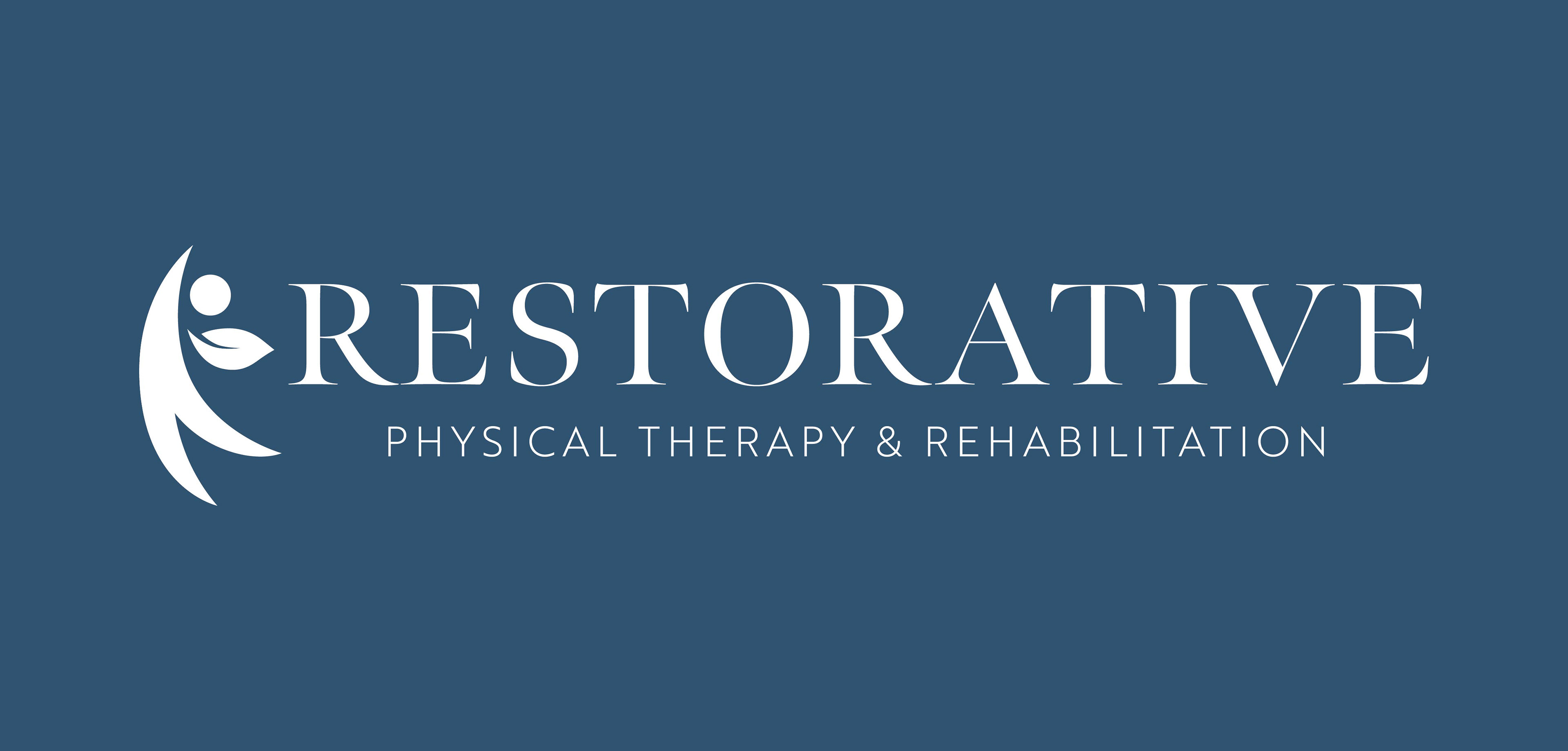
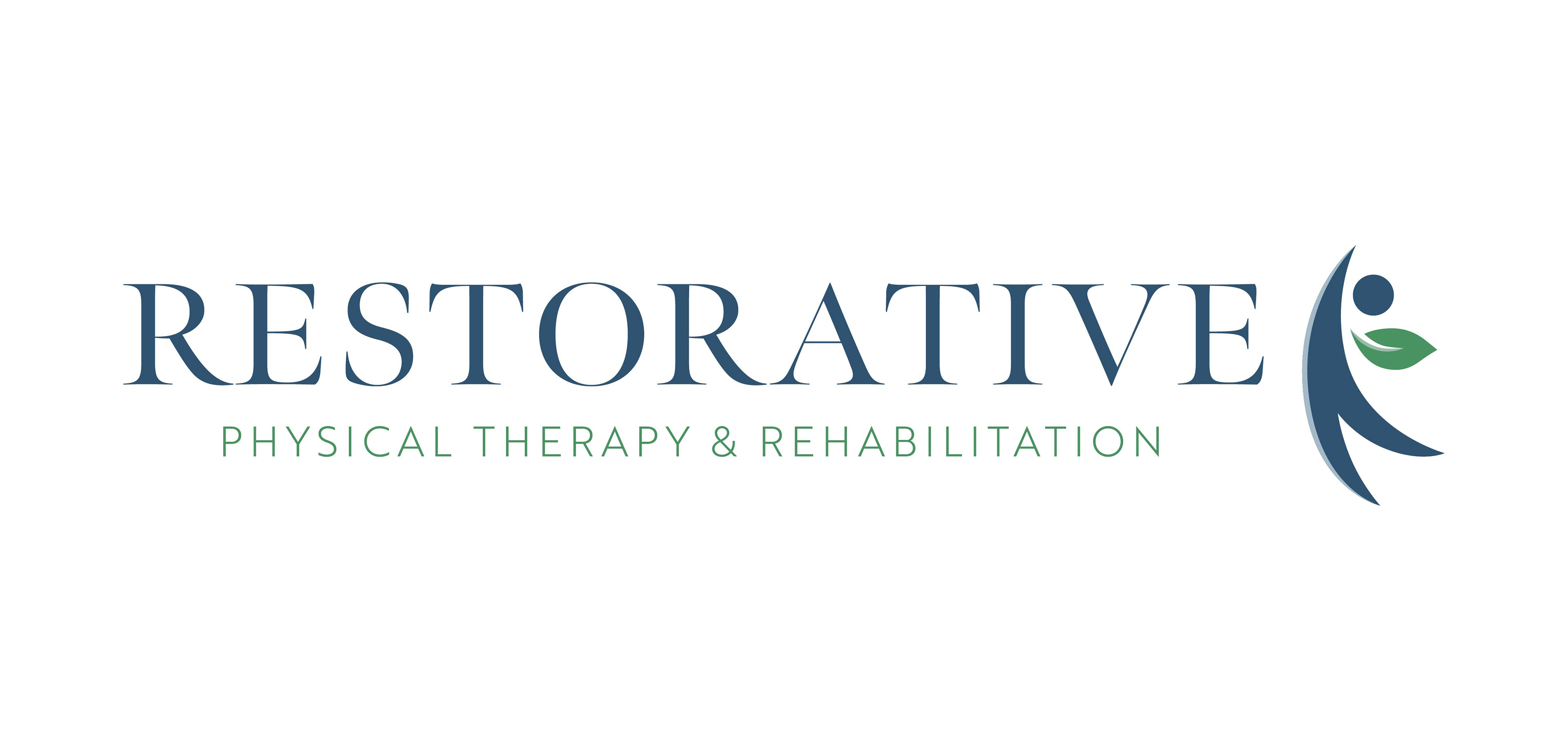
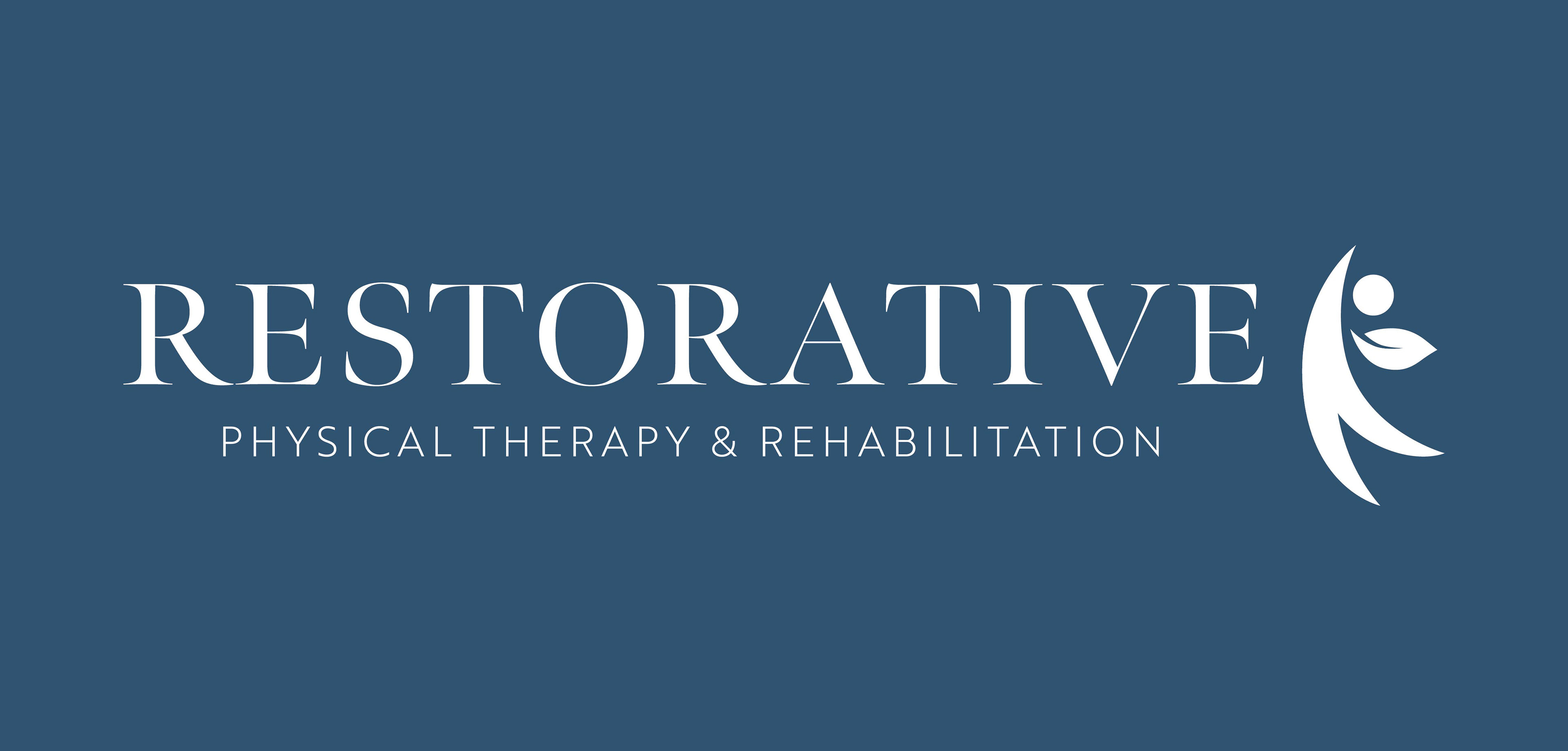
Final Logos


Brand Guide
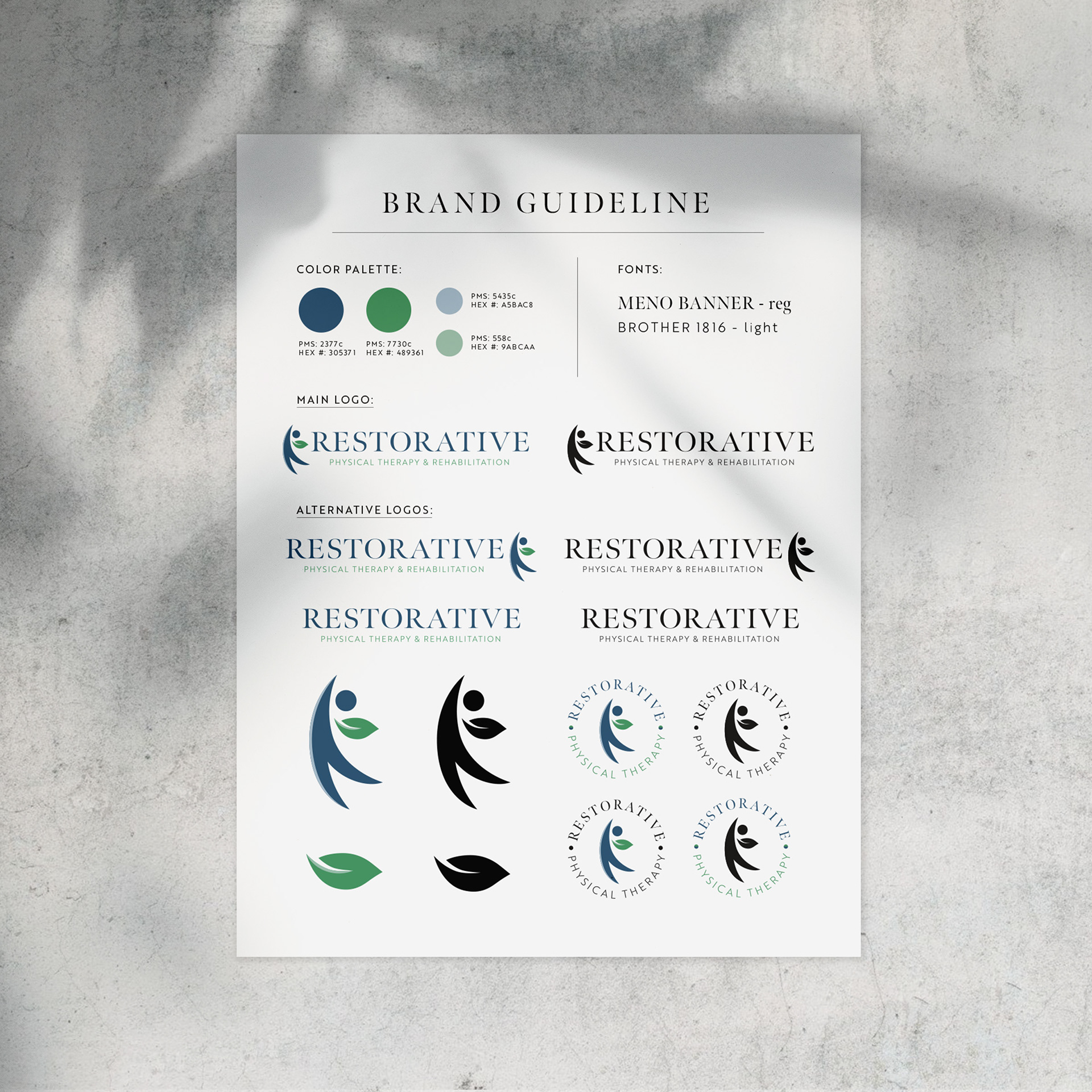
I also provided RPTR with a brand guideline to help organize their brand. This guideline provides a list of their fonts, color palette and logos (main and alternative). I believe it is extremely important for any company/business to have easy access to this information to stay consistent across all their material - It is included in all of my loo packages.